How should you display comments in your app?
Comments are a good way to create engagement within your app and most importantly create value to users/visitors by allowing them collaborate and/or express their opinions
You can show comments in social media app, on a blog post/video, on a question/answers app or in a collaborative app. Within all these options – what’s the best way to display comments to your users? In the chronological order? Show most recent first? Or show top comments (most popular first)?
Today we had to decide how to show comments on tasks in our app. Because every decision we make has to be well documented (and made publicly available) I thought I might as well make fully public. Here’s the way I think of it…
Comments in a Social Media context
When you are having a conversation in a social media context within a small group, you expect that conversation to emulate in person conversations. You have to have a bit of context & you need to understand everyone’s perspective before you can add value to the conversation. Hence a historical/chronological view makes most sense. Some studies even prove that this kind of ordering creates most comments
When you create a conversation around a more popular subject with a larger group that can create a larger number of comments (thousands for instance) the chronology is harder to follow by us humans (as soon as I get AI powers I will probably get past this hurdle :)). In this case it makes most sense to show the comments that are most valuable. There are two ways to evaluate if a comment is valuable – if you are using reactions on comments, you can count the reactions. If you are allowing users to vote up and down comments – you show most upvotes. If you are allowing for threaded comments, you may highlight the comments with most engagement within the threaded comments.
Comments on a blog post/video
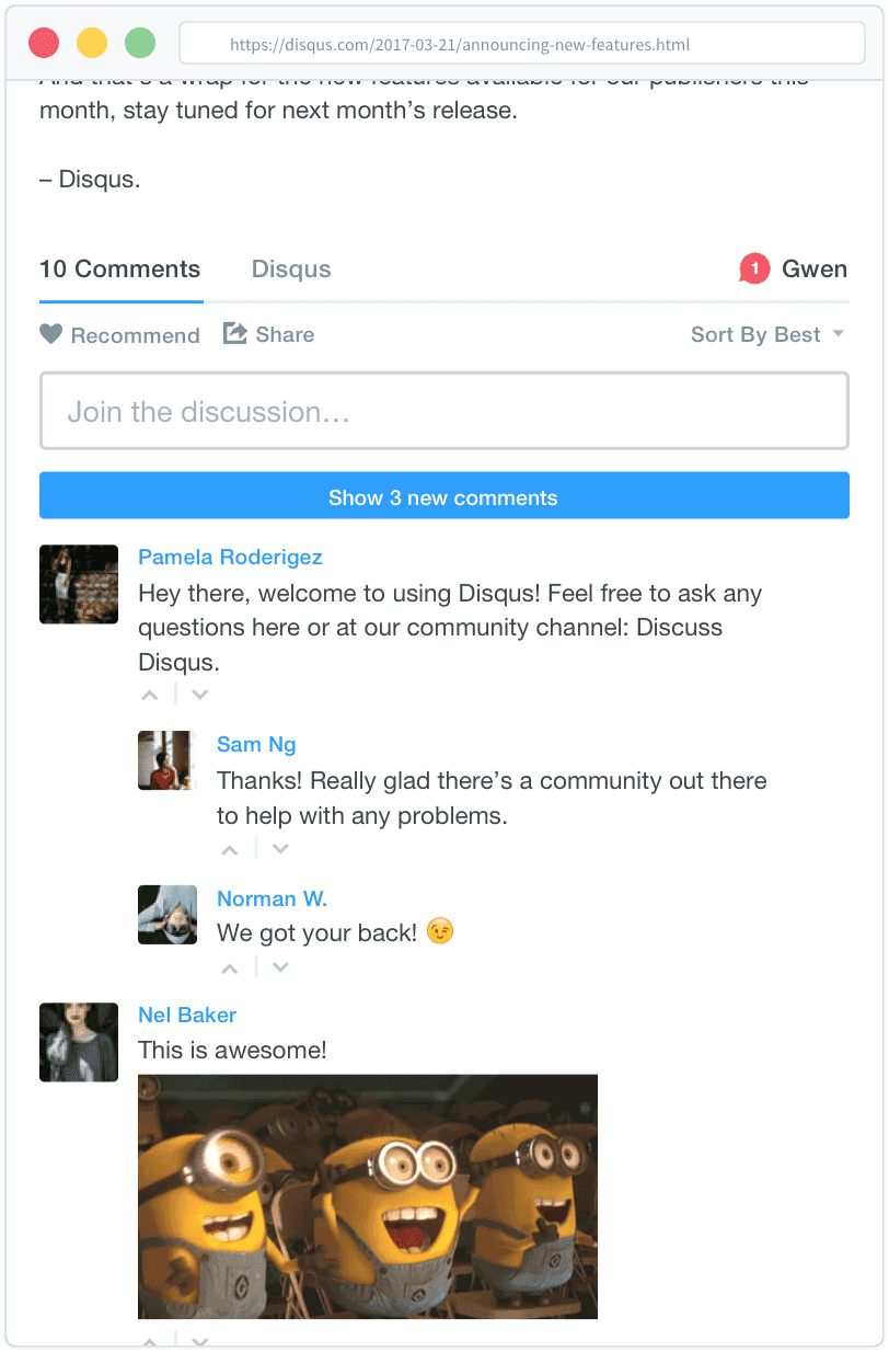
If you look at tools like Disqus , to optimize for most engagement they show newest comments at the top after which they sort them by most valuable first. This was explored in a research paper as well and indeed they confirm this kind of sorting allows for most engagement

You’d think that Google has mastered this kind of A/B testing as well – they indeed show newest comments on their Youtube pages as well.
Comments within a question/answers context
This use case is pretty straightforward. On websites like Stackoverflow or Quora, you want to make sure that answers with most upvotes get seen at the top (though it must be hard to prevent this algorithm from being rigged) and within each answer
Comments in a collaborative app
In apps like Jira or Github where developers need to comment on a issue they will typically ask for more details about a issue, debate whether or not an issue is completed, add notes about dependencies or additional work that needs to be done on a issue. Because these issues are public in a board, usually having the information in linear format (from oldest to newest) makes most sense. A QA engineer needs to understand the full context before proceeding with the full test plan. And if some other developer takes over a task, understanding full history is most important before proceeding with the completing of that task.

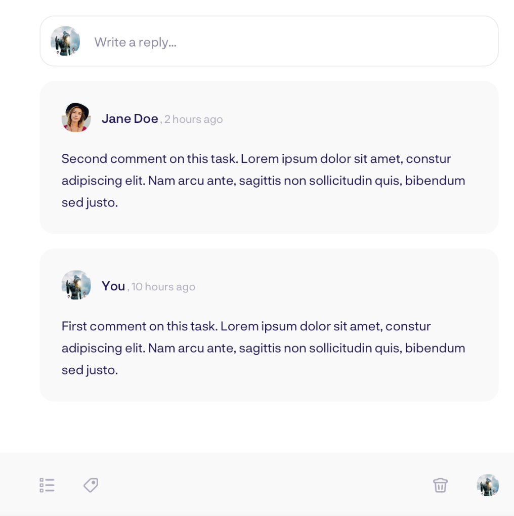
In GipsyBot we have users delegating tasks to other users. In this context they will ask context about the task, give an update on the task or debate if a task has been completed or not. In that regard there are some similarities with tools like Jira. But the tasks are less public. And typically the interactions on a task are between two people. It presumes they already have context on the task. To make sure they are most efficient to getting something done, presenting them with the most recent comment at the top saves them time. And at GipsyBot we’re all into TimeHacking (so much so that we created a community on Facebook to exchange ideas on how to live the most productive life. If you are as passionate about it as we are, we can’t wait to have you join!) so the decision was easy.

Curious to hear other perspectives on this topic and ways to engage your users through even better default sorting of comments in the comments below 😉